This is our finished music video overall very proud of it, we have had to sacrifice multiple scenes to get it to fit we the song but I believe we cooked up the correct formulae. Thank you and enjoy
ODESZA Music video DVD cover

Sunday, 24 April 2016
Friday, 22 April 2016
Question 4: Technology Used
To answer question 4 I decided to make do a commentary this way we are able to explain the technologies we used easier.
Question 3 : Audience Feedback
What have you learned from your audience feedback?
To answer this question I have decided to do it in blog form as its easier to get the information out into a post. To gather information from our audience I decided to do a questionnaire (very original I know). I felt a questionnaire was an easy way to get a good sample size to give me feedback on my music video. Below is what questions I decided to ask:

The questions were:
- What do you believe the music video is trying to express?Please write here:
- What is your opinion on the costume?
- Do you think that the CD Cover and Poster represents the narrative of the music video (nature versus urban)?
- Do you agree with the locations used ?
- How relate-able was the character out of 10?
For the first question a lot of people answered loneliness which was one of the things we were originally going to try and achieve. Only a few got the contrast between nature and urban area which is what we were aiming to achieve. This shows that we should have brought much more emphasis on the contrast.What learnt from the feedback was that the costume we designed worked effectively to stand out and made the production visually interesting. People believe that my poster and CD cover definitely showed the narrative and it became clearer after watching the music video and looking back. Most people liked the fact they could recognise the urban locations and not no the countryside locations as they felt this reinforced the narrative. The people I asked generally did not see the character as a relatable character which is a shame as we used the mask so the viewer could immerse themselves in the music video. The reckons to rectify this we would need show more of the character and maybe show more interaction with the environment within the scene.
Question 2: Ancillary Texts
Question 2 from Jordan Bunning
Due to formatting issues the last slide has been unevenly cropped. It reads just toget my view across that we have a disregard for nature.
Due to formatting issues the last slide has been unevenly cropped. It reads just toget my view across that we have a disregard for nature.
Question 1: Conventions
For question 1 I have decided to use a prezi to show how we used conventions and how we have challenged others.
Wednesday, 13 April 2016
Friday, 8 April 2016
Ancillary Text: Poster
I decided to do a poster for my second ancillary text. A poster I felt was much easier to portray story and entice viewers as its a simple thing to take in making very effective. Condensing information is very important as studies show that people have a 7 second attention span when passively taking in information. This makes a poster more likely to entice viewers as it's just one image with small amount of text making it quick to process the whole thing. You can see the poster below.


Friday, 11 March 2016
Hypodermic Needle Theory

Below are some examples of these adverts:
Thursday, 10 March 2016
Mask: Film Ideas
For a while I have been trying to experiment with things we could do with the mask. I thought of doing a zoom into the mask and then cutting to footage of the character walking out a alley way or appearing from the dark. An example of what this would look like can be seen below. I am unsure if this is possible with the editing software we currently have but I will try to find out.
Tuesday, 23 February 2016
Drawing Time-lapse
We decided to film an extra segment that can be used for the intro or ending of our music video. This segment involved a time lapse of someone drawing the ODESZA group name. We chose to pick someone outside the group who had done graphic design. This was to achieve the quality we wanted as the design isn't as easy as it looks. This shot could also be used for my part of website to advertise the name in an appealing way.

Mask Ideas
For our character in the music video we and to choose a mask design. When we were first deciding we were unsure of keeping the mask idea but after looking at a few designs we were able to come to a conclusion. We also asked people what they thought of the designs. This is so we could gather some audience feedback.
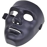 This is the first design we looked at we liked the idea it still showed some parts of the characters face giving some character however the people we asked said it reminded them of the guy fawkes mask and we didn't want to influence peoples perception to think the character is a vigilante or activist.
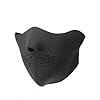
This is the second mask we looked at we liked it for the same reason as the first but people again were influenced to believe the character was wearing the mask to hide there identity. half face mask tend to be commonly linked with criminal acts and we didn't want the viewer to believe that the character was an anarchist. We started to realise that we needed something neutral.
 This is the mask we chose. We believed that completely taking away the identity of the individual would mean there are no influences to how the viewer perceives the character. Leaving things up for interpretation allow the audience to decide the own views without being influenced.
Saturday, 20 February 2016
Inspiration for Poster and CD Cover


I was highly inspired by the the music video of bastille Pompeii for most of my design ideas. This is mainly because I like the Idea that they are referencing pompeii which was a natural disaster and applying it to the city life in the video. In both my cover design and poster I will try and show nature taking over or returning to the hooded man. This idea of nature returning links nicely with the album title In Return.
Friday, 19 February 2016
Editing
Our editing required us to plan out what effects and aftercare we need to use in order to achieve the atmosphere below is what we decided and some examples:
Transitions
We wanted to make sure our video had smooth transitions, which is achieved with no effects but making sure the clips are flush with each other, for the time lapses this was to give the perception of time. For the walking clips that are cut so the character is jumping forward. For This we decided to use some cross fading to mask the jagged look as again it was to emphasize time passing.
Color Grading
We decided to make our music video very vibrant but dark this was achieved through colour grading. Using a treatment can be the final touch needed to achieve the atmosphere you want. The majority of films and music videos will use color grading to give it a professional finish. An example of good colour grading can be found in the A2 media production
These are the main factors we wanted to research as they can make or break a production, thus making it quintessential to our media production.
Thursday, 18 February 2016
Flying the Drone
George Moore told us that he owned a drone with a camera attached we told him to do some test footage so we could see how we could implement it into our music video. We had an idea for the final scene to have the drone do a drop down view of the bonfire, however we need to see how the footage would turn out first. Below is the drone footage doing a sweep.
We liked this footage and the sweep gave us an idea for a shot where the drone could cross a field and about halfway through would be the character. It looks likely we are to incorporate this in someway.
We liked this footage and the sweep gave us an idea for a shot where the drone could cross a field and about halfway through would be the character. It looks likely we are to incorporate this in someway.
Thursday, 11 February 2016
Chorus Idea
WE had an idea for a transition for the chorus. We took a picture of the character and used photo shop to create a black background. We wanted the red jumper to show up which is why we took the picture with a flash on, this looks effective as it stands out against the black background. We tried to take a photo with . I then edited short black outs to the picture to give it a flickering effect. It can be seen going to the beat of the music towards the end of the music video.

Moral Panic
Cohen (1972) believed in Moral panics. Moral Panics are a creation of the media. The media does this by focusing on a particular topic through news programs, newspapers, etc. When people pick up on the amount of focus they start to believe it to be a huge problem.
Some examples of moral panics are the Mods and Rockers (1960) ,Punks (1970) or Hoodies (2005) these are all negative examples of moral panics. The moral panic lead to ban of hoodies in the blue waters shopping centre the link to the article is below.
http://news.bbc.co.uk/1/hi/england/kent/4534903.stm


More positive examples of moral panics are the ISIS terrorist organisation and the syrian refugee crisis as these are real problems effecting the world. This puts the argument against moral panics off balance cause it shows that these moral panics can help boost efforts to help out the world. Charities like UNHCR benefitted from this as people felt inclined to donate to charity.
UNHCR - Donate

Some examples of moral panics are the Mods and Rockers (1960) ,Punks (1970) or Hoodies (2005) these are all negative examples of moral panics. The moral panic lead to ban of hoodies in the blue waters shopping centre the link to the article is below.
http://news.bbc.co.uk/1/hi/england/kent/4534903.stm
More positive examples of moral panics are the ISIS terrorist organisation and the syrian refugee crisis as these are real problems effecting the world. This puts the argument against moral panics off balance cause it shows that these moral panics can help boost efforts to help out the world. Charities like UNHCR benefitted from this as people felt inclined to donate to charity.
UNHCR - Donate
Thursday, 28 January 2016
Ancillary Text: Cover Design
This is the design I have made for the ancillary task. we have decided on a change of narrative. We have now decided that the red hoodie is trying to escape inner city life but is struggling to get there. This is why I have chosen to contrast the nature with the city scape. The tsunami is meant to represent almost a cleanse of their past life. The idea of using nature is to symbolise freedom as this is what most people assume when the imagine a countryside or tropical beach.


We feel that the idea of trying to escape is very relatable to our target audience. This need for escape builds up in everyone and its normally due to stress or boredom of their lifestyle. This makes it a very relevant concept to get across.
Thursday, 21 January 2016
Cover DVD Design
We decided that the back of the cover didn't match up with the colour scheme of the front this made the whole design look unfinished So I decided to use a gradient to mix the red in to ODESZA. I also changed the font to make it fit the design as the sharp capital letters make it look similar to graffiti. Having a specific colour scheme can make your product more recognisable for example Coca Cola can be recognised globally by the colours alone.

Below is the final design of the product we decided to emphasise the subtitle a bit more by positioning it better and also applying the colour scheme.

Tuesday, 19 January 2016
Starting DVD Cover Design
One of the ancillary texts was to design a DVD cover we decided to do this through the use of publisher and photoshop. We designed the majority of the cover using publisher as the interface was easier for us when organising images and text on the cover.


We thought the cover should accurately resent the atmosphere and treatment of our music video. This is so people can see what they are buying. Keeping up the theme can influence the consumer's viewpoint towards the music video making it easier for us to portray the atmosphere we desire.

We wanted to achieve a dark urban atmosphere To do this we used dark colours and common things seen in urban areas: graffiti and hoodies. Using commonly seen things allows the viewer to understand want we are trying to achieve as they able to create a link between the items.


We thought the cover should accurately resent the atmosphere and treatment of our music video. This is so people can see what they are buying. Keeping up the theme can influence the consumer's viewpoint towards the music video making it easier for us to portray the atmosphere we desire.

This is our initial design
Sunday, 10 January 2016
Media In the Online Age
Below is a documentation of how people have grown to use the internet, I discussed the internet revolution and the history behind the internet. In doing this I have identified that our target audience is wanting a way to break free and escape from society this has made me want to aim to project this into my music video.
Friday, 8 January 2016
My Cover Design
For my cover individual cover design I decided to emphasize the story. My idea was inspired by Strauss ideology of binary opposites. The binary opposites I was going for was nature vs urban. This was also crafted on my belief that mankind has a disregard for nature and would rather exploit the planet for profit. In the cover design I wanted to show that nature is returning to fight back which I symbolized with the tsunami clashing against the cityscape. This also works very well with the album title In Return as it given a meaning.
 |
Subscribe to:
Comments (Atom)